Demo: Matplotlib, Backends
Contents
Demo: Matplotlib, Backends#
UW Geospatial Data Analysis
CEE467/CEWA567
David Shean
import matplotlib.pyplot as plt
import numpy as np
x = np.arange(101)
x
array([ 0, 1, 2, 3, 4, 5, 6, 7, 8, 9, 10, 11, 12,
13, 14, 15, 16, 17, 18, 19, 20, 21, 22, 23, 24, 25,
26, 27, 28, 29, 30, 31, 32, 33, 34, 35, 36, 37, 38,
39, 40, 41, 42, 43, 44, 45, 46, 47, 48, 49, 50, 51,
52, 53, 54, 55, 56, 57, 58, 59, 60, 61, 62, 63, 64,
65, 66, 67, 68, 69, 70, 71, 72, 73, 74, 75, 76, 77,
78, 79, 80, 81, 82, 83, 84, 85, 86, 87, 88, 89, 90,
91, 92, 93, 94, 95, 96, 97, 98, 99, 100])
y = 2*x
y2 = x**2
y
array([ 0, 2, 4, 6, 8, 10, 12, 14, 16, 18, 20, 22, 24,
26, 28, 30, 32, 34, 36, 38, 40, 42, 44, 46, 48, 50,
52, 54, 56, 58, 60, 62, 64, 66, 68, 70, 72, 74, 76,
78, 80, 82, 84, 86, 88, 90, 92, 94, 96, 98, 100, 102,
104, 106, 108, 110, 112, 114, 116, 118, 120, 122, 124, 126, 128,
130, 132, 134, 136, 138, 140, 142, 144, 146, 148, 150, 152, 154,
156, 158, 160, 162, 164, 166, 168, 170, 172, 174, 176, 178, 180,
182, 184, 186, 188, 190, 192, 194, 196, 198, 200])
y2
array([ 0, 1, 4, 9, 16, 25, 36, 49, 64,
81, 100, 121, 144, 169, 196, 225, 256, 289,
324, 361, 400, 441, 484, 529, 576, 625, 676,
729, 784, 841, 900, 961, 1024, 1089, 1156, 1225,
1296, 1369, 1444, 1521, 1600, 1681, 1764, 1849, 1936,
2025, 2116, 2209, 2304, 2401, 2500, 2601, 2704, 2809,
2916, 3025, 3136, 3249, 3364, 3481, 3600, 3721, 3844,
3969, 4096, 4225, 4356, 4489, 4624, 4761, 4900, 5041,
5184, 5329, 5476, 5625, 5776, 5929, 6084, 6241, 6400,
6561, 6724, 6889, 7056, 7225, 7396, 7569, 7744, 7921,
8100, 8281, 8464, 8649, 8836, 9025, 9216, 9409, 9604,
9801, 10000])
Plot using %matplotlib inline#
     %matplotlib


     inline
#plt.plot?
#Using pyplot interface
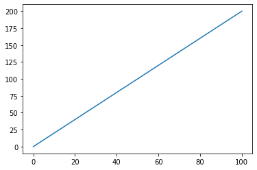
plt.plot(x,y)
[<matplotlib.lines.Line2D at 0x7ff44b01e4f0>]

lines = plt.plot(x,y)
lines[0]
<matplotlib.lines.Line2D at 0x7ff442f1bcd0>
# Don't usually interact with these objects, but can get/set properties
#https://matplotlib.org/stable/api/_as_gen/matplotlib.lines.Line2D.html
lines[0].get_color()
'#1f77b4'
#Add a trailing semicolon to prevent returning lines or axes object
plt.plot(x,y);

Multiple plots on same axes#
Must be in same notebook cell with inline backend!
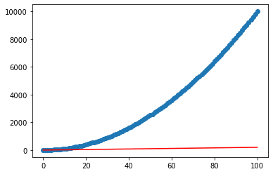
plt.plot(x,y, color='red')
plt.scatter(x,y2, marker='o')
<matplotlib.collections.PathCollection at 0x7ff442ea65b0>
Subplots#
Convenience function to create new figure and axes
https://matplotlib.org/stable/tutorials/introductory/usage.html#parts-of-a-figure
https://matplotlib.org/stable/api/_as_gen/matplotlib.pyplot.subplots.html
Note returned objects
plt.subplots()
(<Figure size 432x288 with 1 Axes>, <AxesSubplot:>)
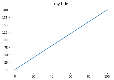
#Using object-oriented interface (OOI)
fig, ax = plt.subplots()
ax.plot(x,y)
ax.set_title('my title')
Text(0.5, 1.0, 'my title')
fig

ax
<AxesSubplot:title={'center':'my title'}>
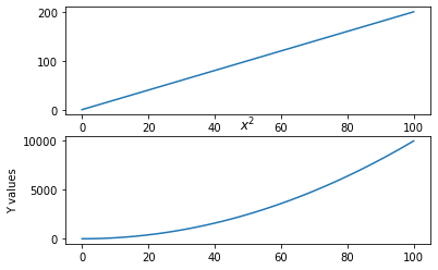
# Two-panel figure
fig, axa = plt.subplots(2, 1)
axa[0].plot(x,y)
axa[1].plot(x,y2);
axa[1].set_ylabel('Y values')
axa[1].set_title("$x^2$")
Text(0.5, 1.0, '$x^2$')
#Try to set the title on existing plot - doesn't work!
axa[1].set_title("$x^2$")
Text(0.5, 1.0, '$x^2$')
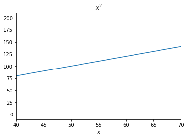
#Can modify axes and set title in same cell
fig, ax = plt.subplots(1)
ax.plot(x,y)
ax.set_title("$x^2$")
ax.set_xlabel('x')
ax.set_xlim(40,70)
(40.0, 70.0)
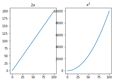
fig, axa = plt.subplots(1, 2)
axa[0].plot(x,y)
axa[0].set_title("$2x$")
axa[1].plot(x,y2);
axa[1].set_title("$x^2$")
Text(0.5, 1.0, '$x^2$')
#Save figure
fig, ax = plt.subplots(1)
ax.plot(x,y)
fig.savefig('my_figure.jpg', dpi=150)

Using %matplotlib widget backend for interactive plotting#
#May need to execute this cell again if using "Run all cells"
     %matplotlib


     widget
plt.plot(x,y)
[<matplotlib.lines.Line2D at 0x7ff442d48e50>]
#Add to the figure above!
plt.plot(x,y2);
Using Seaborn#
import seaborn as sns
sns.set_theme()
fig, ax = plt.subplots()
ax.plot(x,y)
[<matplotlib.lines.Line2D at 0x7ff43a5c6760>]
#Turn off Seaborn for now
sns.reset_orig()
Pandas built-in plotting#
import pandas as pd
# Create a Pandas DataFrame
df = pd.DataFrame(np.array([y, y2]).T, index=x, columns=['y', 'y2'])
df
| y | y2 | |
|---|---|---|
| 0 | 0 | 0 |
| 1 | 2 | 1 |
| 2 | 4 | 4 |
| 3 | 6 | 9 |
| 4 | 8 | 16 |
| ... | ... | ... |
| 96 | 192 | 9216 |
| 97 | 194 | 9409 |
| 98 | 196 | 9604 |
| 99 | 198 | 9801 |
| 100 | 200 | 10000 |
101 rows × 2 columns
# Use the convenient, built-in Pandas plot function (matplotlib under the hood)
df.plot()
<AxesSubplot:>
#Scatterplot
df.plot(kind='scatter', x='y', y='y2', color='k')
<AxesSubplot:xlabel='y', ylabel='y2'>
Using hvPlot (Holoviews and Bokeh)#
import hvplot.pandas
df.hvplot()