08 Excercises: Vector time series, SNOTEL
Contents
08 Excercises: Vector time series, SNOTEL
UW Geospatial Data Analysis
CEE498/CEWA599
David Shean
Objectives
Explore spatial and temporal relationships of time series data, collected by networks of in-situ stations
Learn about dynamic API queries, data ingestion into Pandas/GeoPandas
Working with Pandas Timestamp and Python DateTime objects
Explore spatial correlation of time series records
Explore some simple interpolation routines to create continuous gridded values from sparse points
Explore some fundamental concepts and metrics for snow science
Visualize recent snow accumulation in your region
import os
from datetime import datetime
import numpy as np
import matplotlib.pyplot as plt
import pandas as pd
import geopandas as gpd
from shapely.geometry import Point
import folium
import contextily as ctx
import scipy.stats
import scipy.interpolate
#Define variable to store current year
#curr_y = datetime.now().year
curr_y = pd.to_datetime("today").year
curr_y
2022
Part 0: Prepare and load data
The 08_SNOTEL_download notebook will prepare a geojson of SNOTEL sites with metadata and a pickled DataFrame containing snow depth time series for all sites
May require ~30-40 minutes to query all sites and download data. I recommend you run the original notebook interactively in a separate window rather than running from this notebook with %run magic command.
Once files are saved to disk, either copy to the directory with this notebook, or update the relative paths in the following cells.
#%run 08_SNOTEL_download.ipynb
sites_fn = 'snotel_conus_sites.json'
singlesite_pkl_fn = 'SNOTEL-SNWD_D_679_WA_SNTL.pkl'
allsites_pkl_fn = 'SNOTEL-SNWD_D_CONUS.pkl'
Load state polygons
states_url = 'http://eric.clst.org/assets/wiki/uploads/Stuff/gz_2010_us_040_00_5m.json'
#states_url = 'http://eric.clst.org/assets/wiki/uploads/Stuff/gz_2010_us_040_00_500k.json'
states_gdf = gpd.read_file(states_url)
Load SNOTEL sites geojson
#Note: geojson uses integer index, so need the `set_index` below
sites_gdf_all = gpd.read_file(sites_fn).set_index('index')
sites_gdf_all.head()
| code | name | network | elevation_m | site_property | geometry | |
|---|---|---|---|---|---|---|
| index | ||||||
| SNOTEL:301_CA_SNTL | 301_CA_SNTL | Adin Mtn | SNOTEL | 1886.712036 | {'county': 'Modoc', 'state': 'California', 'si... | POINT (-120.79192 41.23583) |
| SNOTEL:907_UT_SNTL | 907_UT_SNTL | Agua Canyon | SNOTEL | 2712.719971 | {'county': 'Kane', 'state': 'Utah', 'site_comm... | POINT (-112.27118 37.52217) |
| SNOTEL:916_MT_SNTL | 916_MT_SNTL | Albro Lake | SNOTEL | 2529.840088 | {'county': 'Madison', 'state': 'Montana', 'sit... | POINT (-111.95902 45.59723) |
| SNOTEL:908_WA_SNTL | 908_WA_SNTL | Alpine Meadows | SNOTEL | 1066.800049 | {'county': 'King', 'state': 'Washington', 'sit... | POINT (-121.69847 47.77957) |
| SNOTEL:302_OR_SNTL | 302_OR_SNTL | Aneroid Lake #2 | SNOTEL | 2255.520020 | {'county': 'Wallowa', 'state': 'Oregon', 'site... | POINT (-117.19258 45.21328) |
Part 1: Evaluate SNOTEL sites
Create a plot using geopandas explore to get a better sense of distribution, site names and other fields
#sites_gdf_all.explore(column='elevation_m', cmap='inferno')
Reproject the sites GeoDataFrame
Can use the same Albers Equal Area projection from previous labs, or recompute based on bounds and center of SNOTEL sites
aea_proj = '+proj=aea +lat_1=37.00 +lat_2=47.00 +lat_0=42.00 +lon_0=-114.27'
sites_gdf_all_proj = sites_gdf_all.to_crs(aea_proj)
#Reproject states
states_gdf_proj = states_gdf.to_crs(aea_proj)
#Isolate WA state polygon
wa_state = states_gdf_proj.loc[states_gdf_proj['NAME'] == 'Washington']
Create a scatterplot and overlay the state polygons
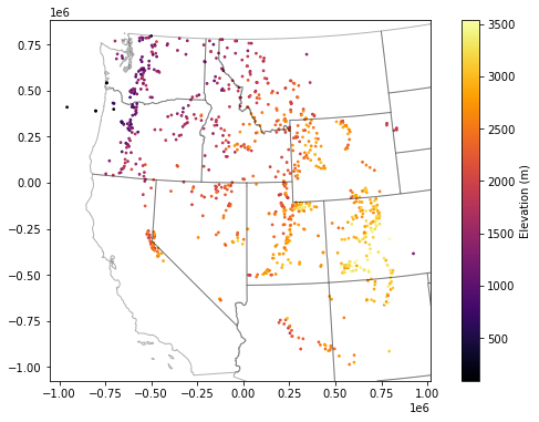
f, ax = plt.subplots(figsize=(10,6))
sites_gdf_all_proj.plot(ax=ax, column='elevation_m', markersize=3, cmap='inferno', legend=True, legend_kwds={'label':'Elevation (m)'})
ax.autoscale(False)
states_gdf_proj.plot(ax=ax, facecolor='none', edgecolor='k', alpha=0.3);
Isolate WA sites
As with the GLAS point example, we could do
intersectsor a spatial join with WA polygonBut probably easiest to filter records with ‘WA’ in the index
Note: need to convert the SNOTEL DataFrame index to
strcontainsmight be a nice option
Sanity check - note number of records and create a quick scatterplot to verify
wa_idx = sites_gdf_all_proj.index.str.contains('WA')
sites_gdf_wa = sites_gdf_all_proj[wa_idx]
sites_gdf_wa.shape
(84, 6)
#Prepare list of WA stations for use later in lab
#Can preserve as Pandas Index object
wa_stations = sites_gdf_all_proj.index[wa_idx]
#Or convert to list, if desired
#wa_stations = list(sites_gdf_all_proj.index[wa_idx])
wa_stations.shape
(84,)
#Prepare a list of WA stations above a predefined elevation threshold
high_thresh = 1400 #meters
wa_stations_high = sites_gdf_wa.index[sites_gdf_wa['elevation_m'] > high_thresh]
wa_stations_high.shape
(32,)
Create scatterplot to verify and add contextily basemap
Can specify our AEA crs to the
crskeyword in the ctxadd_basemapfunction to reproject on the fly
f, ax = plt.subplots()
wa_state.plot(ax=ax, facecolor='none', edgecolor='black')
sites_gdf_wa.plot(ax=ax, column='elevation_m', markersize=20, edgecolor='k', cmap='inferno', \
                  legend=True, legend_kwds={'label':'Elevation (m)'})
ctx.add_basemap(ax=ax, crs=sites_gdf_wa.crs, source=ctx.providers.Stamen.Terrain)
ax.set_title('All WA SNOTEL Stations');

f, ax = plt.subplots()
wa_state.plot(ax=ax, facecolor='none', edgecolor='black')
sites_gdf_wa.loc[wa_stations_high].plot(ax=ax, column='elevation_m', markersize=20, edgecolor='k', \
                                        cmap='inferno', legend=True, legend_kwds={'label':'Elevation (m)'})
ctx.add_basemap(ax=ax, crs=sites_gdf_wa.crs, source=ctx.providers.Stamen.Terrain)
ax.set_title('All WA SNOTEL Stations > %0.0f m' % high_thresh);

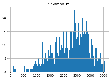
Create a histogram showing elevation of WA sites and all sites in Western US
These should be two histograms on the same axes
Thought questions:
Do these elevations seem to provide a good sample of elevations where we expect snow to accumulate?
What do you notice about the WA sample?
ax = sites_gdf_all.hist('elevation_m', bins=128)
sites_gdf_wa.hist('elevation_m', bins=64, ax=ax);

What is the highest site in WA?
sitecode_max = sites_gdf_wa['elevation_m'].idxmax()
sites_gdf_wa.loc[sitecode_max]
code                                                   515_WA_SNTL
name                                                    Harts Pass
network                                                     SNOTEL
elevation_m                                            1978.151978
site_property    {'county': 'Okanogan', 'state': 'Washington', ...
geometry              POINT (-471261.4818625616 765568.9706388527)
Name: SNOTEL:515_WA_SNTL, dtype: object
What is highest site in Western U.S.?
sitecode_max = sites_gdf_all['elevation_m'].idxmax()
sites_gdf_all.loc[sitecode_max]
code                                                  1058_CO_SNTL
name                                                      Grayback
network                                                     SNOTEL
elevation_m                                            3541.775879
site_property    {'county': 'Rio Grande', 'state': 'Colorado', ...
geometry             POINT (-106.53782653808594 37.47032928466797)
Name: SNOTEL:1058_CO_SNTL, dtype: object
sites_gdf_all.hist('elevation_m', bins=128);
Which site is the highest elevation?
sitecode = sites_gdf_all['elevation_m'].idxmax()
sites_gdf_all.loc[sitecode]
code                                                  1058_CO_SNTL
name                                                      Grayback
network                                                     SNOTEL
elevation_m                                            3541.775879
site_property    {'county': 'Rio Grande', 'state': 'Colorado', ...
geometry             POINT (-106.53782653808594 37.47032928466797)
Name: SNOTEL:1058_CO_SNTL, dtype: object
Part 2: Single site time series analysis
Load single site time series
This was for Paradise site on Mt. Rainer
sitecode = 'SNOTEL:679_WA_SNTL'
values_df = pd.read_pickle(singlesite_pkl_fn)
values_df.head()
| value | qualifiers | censor_code | date_time_utc | method_id | method_code | source_code | quality_control_level_code | |
|---|---|---|---|---|---|---|---|---|
| datetime | ||||||||
| 2006-08-18 00:00:00+00:00 | 0.0 | E | nc | 2006-08-18T00:00:00 | 0 | 0 | 1 | 1 |
| 2006-08-19 00:00:00+00:00 | 0.0 | E | nc | 2006-08-19T00:00:00 | 0 | 0 | 1 | 1 |
| 2006-08-20 00:00:00+00:00 | 0.0 | E | nc | 2006-08-20T00:00:00 | 0 | 0 | 1 | 1 |
| 2006-08-21 00:00:00+00:00 | 0.0 | E | nc | 2006-08-21T00:00:00 | 0 | 0 | 1 | 1 |
| 2006-08-22 00:00:00+00:00 | 0.0 | E | nc | 2006-08-22T00:00:00 | 0 | 0 | 1 | 1 |
values_df.plot();

#Get number of decimal years between first and last observation
nyears = (values_df.index.max() - values_df.index.min()).days/365.25
nyears
15.51813826146475
Compute the integer day of year (doy) and integer day of water year (dowy)
Can get doy for each record with
df.index.dayofyearAdd a new column to store these values
https://pandas.pydata.org/pandas-docs/version/0.19/generated/pandas.DatetimeIndex.dayofyear.html
For the day of water year calculation, you can offset the existing integer doy values so that Oct 1 = 1, then account for any values outside the expected range (e.g., less than 0, greater than 366)
Add another column to store these values
#Add DOY and DOWY column
#Need to revisit for leap year support
def add_dowy(df, col=None):
    if col is None:
        df['doy'] = df.index.dayofyear
    else:
        df['doy'] = df[col].dayofyear
    # Sept 30 is doy 273
    df['dowy'] = df['doy'] - 273
    df.loc[df['dowy'] <= 0, 'dowy'] += 365
    #df['dowy'] = (df['doy'].index - pd.DateOffset(months=9)).dayofyear
#Add new columns
add_dowy(values_df)
#Quick sanity check around beginning of WY, make sure Oct 1 = 1
values_df[f'{curr_y-1}-09-28':f'{curr_y-1}-10-03']
#Quick sanity check for calendar year end/start values
values_df[f'{curr_y-1}-12-29':f'{curr_y}-01-03']
Compute statistics for each day of water year, using values from all years
Seems like a Pandas groupby/agg might work here
Stats should at least include min, max, mean, and median
stat_list = ['count','min','max','mean','std','median','mad']
doy_stats = values_df.groupby('dowy').agg(stat_list)['value']
doy_stats
| count | min | max | mean | std | median | mad | |
|---|---|---|---|---|---|---|---|
| dowy | |||||||
| 1 | 16 | 0.0 | 9.0 | 0.6250 | 2.247221 | 0.0 | 1.093750 |
| 2 | 16 | 0.0 | 8.0 | 0.5000 | 2.000000 | 0.0 | 0.937500 |
| 3 | 16 | 0.0 | 9.0 | 0.6250 | 2.247221 | 0.0 | 1.093750 |
| 4 | 16 | 0.0 | 5.0 | 0.5625 | 1.364734 | 0.0 | 0.914062 |
| 5 | 16 | 0.0 | 5.0 | 0.5625 | 1.412740 | 0.0 | 0.914062 |
| ... | ... | ... | ... | ... | ... | ... | ... |
| 361 | 16 | 0.0 | 1.0 | 0.0625 | 0.250000 | 0.0 | 0.117188 |
| 362 | 16 | 0.0 | 1.0 | 0.0625 | 0.250000 | 0.0 | 0.117188 |
| 363 | 16 | 0.0 | 1.0 | 0.0625 | 0.250000 | 0.0 | 0.117188 |
| 364 | 16 | 0.0 | 1.0 | 0.1250 | 0.341565 | 0.0 | 0.218750 |
| 365 | 16 | 0.0 | 3.0 | 0.2500 | 0.774597 | 0.0 | 0.437500 |
365 rows × 7 columns
Create a plot of these aggregated dowy values
Your output independent variable (x-axis) should be day of water year (1-366), and dependent variable (y-axis) should be median value for that day of year, computed using values from all available years
You may have to explicitly specify the x and y valuese for your plot function
Something like the 30-year mean and median here: https://www.nwrfc.noaa.gov/snow/plot_SWE.php?id=AFSW1
Extra credit: add shaded regions for standard deviation or normalized median absolute deviation (nmad) for each doy to show spread in values over the full record
Add the daily snow depth values for the current water year
Can use pandas indexing here with simple strings (‘YYYY-MM-DD’), or Timestamp objects
Standard slicing also works with
:
Make sure to
dropnato remove any records missing dataAdd this to your plot
For most recent snow depth value in the record, what is the percentage of “normal”
This will be the snow depth from Wednesday or whenever you ran the download script
Normal can be defined by long-term median for the same dowy across all years at the site
Part 3: Western U.S. time series analysis
Load pickled DataFrame
snwd_df = pd.read_pickle(allsites_pkl_fn)
snwd_df.head()
| SNOTEL:301_CA_SNTL | SNOTEL:907_UT_SNTL | SNOTEL:916_MT_SNTL | SNOTEL:908_WA_SNTL | SNOTEL:302_OR_SNTL | SNOTEL:1000_OR_SNTL | SNOTEL:303_CO_SNTL | SNOTEL:1030_CO_SNTL | SNOTEL:304_OR_SNTL | SNOTEL:306_ID_SNTL | ... | SNOTEL:872_WY_SNTL | SNOTEL:873_OR_SNTL | SNOTEL:874_CO_SNTL | SNOTEL:875_WY_SNTL | SNOTEL:876_MT_SNTL | SNOTEL:877_AZ_SNTL | SNOTEL:1228_UT_SNTL | SNOTEL:1197_UT_SNTL | SNOTEL:878_WY_SNTL | SNOTEL:1033_CO_SNTL | |
|---|---|---|---|---|---|---|---|---|---|---|---|---|---|---|---|---|---|---|---|---|---|
| datetime | |||||||||||||||||||||
| 1984-10-01 00:00:00+00:00 | NaN | NaN | NaN | NaN | NaN | NaN | NaN | NaN | NaN | NaN | ... | NaN | NaN | NaN | NaN | NaN | NaN | NaN | NaN | NaN | NaN |
| 1984-10-02 00:00:00+00:00 | NaN | NaN | NaN | NaN | NaN | NaN | NaN | NaN | NaN | NaN | ... | NaN | NaN | NaN | NaN | NaN | NaN | NaN | NaN | NaN | NaN |
| 1984-10-03 00:00:00+00:00 | NaN | NaN | NaN | NaN | NaN | NaN | NaN | NaN | NaN | NaN | ... | NaN | NaN | NaN | NaN | NaN | NaN | NaN | NaN | NaN | NaN |
| 1984-10-04 00:00:00+00:00 | NaN | NaN | NaN | NaN | NaN | NaN | NaN | NaN | NaN | NaN | ... | NaN | NaN | NaN | NaN | NaN | NaN | NaN | NaN | NaN | NaN |
| 1984-10-05 00:00:00+00:00 | NaN | NaN | NaN | NaN | NaN | NaN | NaN | NaN | NaN | NaN | ... | NaN | NaN | NaN | NaN | NaN | NaN | NaN | NaN | NaN | NaN |
5 rows × 806 columns
Convert snow depth inches to cm
Use these values for the remainder of the lab
Create a histogram of all snow depth values
Use the Pandas
stackfunction here, otherwise you will end up with histograms for each stationConsider using log scale, as you likely have a spike for days with 0 snow depth (several months of each year!)
f, ax = plt.subplots()
snwd_df.stack().hist(bins=128, ax=ax, log=True);

Get the total count of operational stations on each day and plot over time
Thought question:
Can you identify years where a large number of new snow depth sensors were added to the network?
Part 4: Temporal correlation of snow depth for nearby stations
Can use Paradise (‘SNOTEL:679_WA_SNTL’) and nearby station identified on the labeled folium plot above
Plot the time series from both stations
Can also use dropna here, but careful about methodology (
anyvsall, vsthresh)
#Highest site
#site1 = 'SNOTEL:863_WA_SNTL'
#site2 = 'SNOTEL:692_WA_SNTL'
#Paradise and nearby sites
site1 = 'SNOTEL:679_WA_SNTL'
site2 = 'SNOTEL:1085_WA_SNTL'
site3 = 'SNOTEL:1257_WA_SNTL'
site4 = 'SNOTEL:941_WA_SNTL'
site5 = 'SNOTEL:642_WA_SNTL'
Start with two nearby stations
site_list = [site1,site2]
#Use corresponding colors in line and location scatterplots
color_list = ['C%i' % i for i in range(len(site_list))]
snwd_df[site_list]
| SNOTEL:679_WA_SNTL | SNOTEL:1085_WA_SNTL | |
|---|---|---|
| datetime | ||
| 1984-10-01 00:00:00+00:00 | NaN | NaN |
| 1984-10-02 00:00:00+00:00 | NaN | NaN |
| 1984-10-03 00:00:00+00:00 | NaN | NaN |
| 1984-10-04 00:00:00+00:00 | NaN | NaN |
| 1984-10-05 00:00:00+00:00 | NaN | NaN |
| ... | ... | ... |
| 2022-02-15 00:00:00+00:00 | 241.30 | 203.20 |
| 2022-02-16 00:00:00+00:00 | 251.46 | 203.20 |
| 2022-02-17 00:00:00+00:00 | 256.54 | 203.20 |
| 2022-02-18 00:00:00+00:00 | NaN | 203.20 |
| 2022-02-19 00:00:00+00:00 | 243.84 | 198.12 |
13656 rows × 2 columns
Limit to records where both have valid data (drop NaN)
snwd_df[site_list].dropna(thresh=2)
| SNOTEL:679_WA_SNTL | SNOTEL:1085_WA_SNTL | |
|---|---|---|
| datetime | ||
| 2006-10-05 00:00:00+00:00 | 0.00 | 0.00 |
| 2006-10-06 00:00:00+00:00 | 0.00 | 0.00 |
| 2006-10-07 00:00:00+00:00 | 0.00 | 0.00 |
| 2006-10-08 00:00:00+00:00 | 0.00 | 0.00 |
| 2006-10-09 00:00:00+00:00 | 0.00 | 0.00 |
| ... | ... | ... |
| 2022-02-14 00:00:00+00:00 | 233.68 | 198.12 |
| 2022-02-15 00:00:00+00:00 | 241.30 | 203.20 |
| 2022-02-16 00:00:00+00:00 | 251.46 | 203.20 |
| 2022-02-17 00:00:00+00:00 | 256.54 | 203.20 |
| 2022-02-19 00:00:00+00:00 | 243.84 | 198.12 |
5426 rows × 2 columns
Plot location and time series
f, axa = plt.subplots(1,2,figsize=(15,5))
sites_gdf_wa.loc[site_list].plot(facecolor=color_list, edgecolor='k', ax=axa[0])
ctx.add_basemap(ax=axa[0], crs=sites_gdf_wa.crs, source=ctx.providers.Stamen.Terrain, alpha=0.7)
snwd_df[site_list].dropna(thresh=2).plot(ax=axa[1])
plt.tight_layout()

Consider seasonal variability in snow depth evolution for the two sites
Create a scatterplot showing snow depth from site 1 on the y axis and site 2 on the x axis, with color ramp representing DOWY
The points should fall on the 1:1 line if the snow depth evolution was identical
Consider a cyclical color ramp like ‘twilight’ here, so values of 1 and 365 will have similar color
Add doy and dowy columns
#Add column for dowy
add_dowy(snwd_df)
snwd_df[[*site_list,'dowy']].dropna(thresh=2)
| SNOTEL:679_WA_SNTL | SNOTEL:1085_WA_SNTL | dowy | |
|---|---|---|---|
| datetime | |||
| 2006-08-18 00:00:00+00:00 | 0.00 | NaN | 322 |
| 2006-08-19 00:00:00+00:00 | 0.00 | NaN | 323 |
| 2006-08-20 00:00:00+00:00 | 0.00 | NaN | 324 |
| 2006-08-21 00:00:00+00:00 | 0.00 | NaN | 325 |
| 2006-08-22 00:00:00+00:00 | 0.00 | NaN | 326 |
| ... | ... | ... | ... |
| 2022-02-15 00:00:00+00:00 | 241.30 | 203.20 | 138 |
| 2022-02-16 00:00:00+00:00 | 251.46 | 203.20 | 139 |
| 2022-02-17 00:00:00+00:00 | 256.54 | 203.20 | 140 |
| 2022-02-18 00:00:00+00:00 | NaN | 203.20 | 141 |
| 2022-02-19 00:00:00+00:00 | 243.84 | 198.12 | 142 |
5664 rows × 3 columns
#Determine max values to use for axes limits
max_snwd = int(np.ceil(snwd_df[[*site_list]].dropna(thresh=2).max().max()))
f,ax = plt.subplots(dpi=100)
ax.set_aspect('equal')
snwd_df[[*site_list,'dowy']].dropna(thresh=2).plot.scatter(x=site1,y=site2,c='dowy',cmap='twilight', s=1,ax=ax);
ax.plot(range(0,max_snwd), range(0,max_snwd), color='lightgreen', ls='--');

Looks like 679 has greater snow depth later in the season, compared to 1085
Determine Pearson’s correlation coefficient for the two time series
https://en.wikipedia.org/wiki/Pearson_correlation_coefficient
See the Pandas
corrmethodThis should properly handle nan under the hood!
snwd_corr = snwd_df[site_list].corr()
snwd_corr
| SNOTEL:679_WA_SNTL | SNOTEL:1085_WA_SNTL | |
|---|---|---|
| SNOTEL:679_WA_SNTL | 1.000000 | 0.969174 |
| SNOTEL:1085_WA_SNTL | 0.969174 | 1.000000 |
As expected, these two records are highly correlated!
Now repeat for several nearby sites
site_list = [site1,site2,site3,site4,site5]
#Use corresponding colors in line and location scatterplots
color_list = ['C%i' % i for i in range(len(site_list))]
mygdf = sites_gdf_wa.loc[site_list]
mygdf
| code | name | network | elevation_m | site_property | geometry | |
|---|---|---|---|---|---|---|
| index | ||||||
| SNOTEL:679_WA_SNTL | 679_WA_SNTL | Paradise | SNOTEL | 1563.624023 | {'county': 'Pierce', 'state': 'Washington', 's... | POINT (-570102.829 557709.249) |
| SNOTEL:1085_WA_SNTL | 1085_WA_SNTL | Cayuse Pass | SNOTEL | 1597.151978 | {'county': 'Pierce', 'state': 'Washington', 's... | POINT (-553060.628 565941.972) |
| SNOTEL:1257_WA_SNTL | 1257_WA_SNTL | Skate Creek | SNOTEL | 1149.095947 | {'county': 'Lewis', 'state': 'Washington', 'si... | POINT (-577759.243 542830.006) |
| SNOTEL:941_WA_SNTL | 941_WA_SNTL | Mowich | SNOTEL | 963.168030 | {'county': 'Pierce', 'state': 'Washington', 's... | POINT (-584219.828 575219.336) |
| SNOTEL:642_WA_SNTL | 642_WA_SNTL | Morse Lake | SNOTEL | 1648.968018 | {'county': 'Yakima', 'state': 'Washington', 's... | POINT (-548802.595 569633.965) |
f, axa = plt.subplots(1,2,figsize=(15,5))
mygdf.plot(facecolor=color_list, edgecolor='k', ax=axa[0])
for x, y, label, c in zip(mygdf.geometry.x, mygdf.geometry.y, mygdf.code.str.split('_').str[0], color_list):
    axa[0].annotate(label, xy=(x,y), xytext=(0, -15), ha='center', textcoords="offset points", color=c, bbox=dict(boxstyle="square",fc='w',alpha=0.7))
ctx.add_basemap(ax=axa[0], crs=sites_gdf_wa.crs, source=ctx.providers.Stamen.Terrain, alpha=0.7)
snwd_df[site_list].dropna(thresh=2).plot(ax=axa[1])
#snwd_df[site_list].dropna(how='all').plot(ax=axa[1])
plt.tight_layout()

#The Pandas `corr` should properly handle nans
snwd_corr = snwd_df[site_list].corr()
snwd_corr
| SNOTEL:679_WA_SNTL | SNOTEL:1085_WA_SNTL | SNOTEL:1257_WA_SNTL | SNOTEL:941_WA_SNTL | SNOTEL:642_WA_SNTL | |
|---|---|---|---|---|---|
| SNOTEL:679_WA_SNTL | 1.000000 | 0.969174 | 0.911083 | 0.423361 | 0.952133 |
| SNOTEL:1085_WA_SNTL | 0.969174 | 1.000000 | 0.941665 | 0.420001 | 0.977724 |
| SNOTEL:1257_WA_SNTL | 0.911083 | 0.941665 | 1.000000 | 0.494260 | 0.908164 |
| SNOTEL:941_WA_SNTL | 0.423361 | 0.420001 | 0.494260 | 1.000000 | 0.408776 |
| SNOTEL:642_WA_SNTL | 0.952133 | 0.977724 | 0.908164 | 0.408776 | 1.000000 |
Visualize correlation values for different combinations of stations
import seaborn as sns
sns.heatmap(snwd_corr, cmap='RdBu', vmin=-1, vmax=1, square=True);
#Not sure why 0.5 values are not identical color?
#snwd_corr.style.background_gradient(cmap='RdBu').set_precision(2)

Extra Credit: Consider spatial variability of these correlation coefficients
Select a reference station
Compute correlation scores with this reference station
Join the correlation score values with original GeoDataFrame containing Point geometries
Create a scatter plot (map) with color ramp showing correlation score
Extra Credit: Consider the correlation as a function of distance from the reference station
Compute the distance in km between the reference station and all other stations
Create a plot of correlation coefficient vs. distance
Part 5: Correlation for all SNOTEL sites across Western U.S.
Consider correlation vs. distance
Consider correlation vs. elevation (relative to ref station elevation)
Create a map to consider spatial variability in correlation
Part 6: Compute daily snow depth difference for all stations
This represents daily snow accumulation or ablation
See the Pandas
difffunctionMake sure you specify the axis properly to difference over time (not station to station), and sanity check
This should correctly account for missing values, but need to double-check
Sanity check with
tail- most values should be relatively small (+/-1-6)
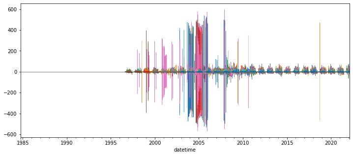
Create plot showing this daily accumulation for all sites
Can start by trying to plot a subset of sites - every 10th, for example (
snwd_df_diff.iloc[:, ::10].plot())May require a few minutes to plot all ~800 sites
Adjusting the ylim appropriately
Probably best to set
legend=Falsein your plot callAdd a black horizontal line at 0 with linewidth=0.5
f,ax = plt.subplots(figsize=(12,5))
snwd_df_diff.iloc[:, ::10].plot(ax=ax,legend=False, lw=0.5)
ax.axhline(0, color='k', lw=0.5);
Interpretation (Provide brief written response these questions) ✍️
Do you think you can confidently identify large snow accumulation events using these difference values?
Are some periods or sensors noisier than others?
When the measured snow depth increases from one day to the next, what happened?
When the measured snow depth decreases from one day to the next, what happened?
Hint: during the winter, some days never get above freezing, but snow depths still decrease…
Extra Credit: Design filters to remove artifacts and outliers
Could likely design a series of filters to remove outliers from original snow depth value time series and the difference time series for each site
One idea:
What is the maximum amount of snowfall you would expect in a 24-hour period?
How about the maximum decrease in snow depth in a 24-hour period?
Can also combine multiple stations for another round of filters:
If a single station shows an increase of 2 m, but all others show a decrease, is that realistic?
Other considerations:
mean +/- (3 * std) is often used to remove outliers from normally distributed values (but is this the case for your difference values?)
Z-score threshold (same idea): https://www.geeksforgeeks.org/z-score-for-outlier-detection-python/
Maybe come back to this if you have time later, for now, just note the presence of measurement errors
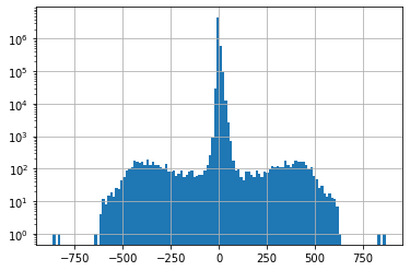
f, ax = plt.subplots()
snwd_df_diff.stack().hist(bins=128, ax=ax, log=True);
snwd_df_diff.count().sum()
5168686
#Mean and std for entire dataset before filtering
print(np.nanmean(snwd_df_diff.values), np.nanstd(snwd_df_diff.values))
0.003724250225299048 13.679468269059988
#Assume maximum daily increase due to snowfall of 1.7 m
max_diff = 170
idx = snwd_df_diff > max_diff
#Assume maximum daily decrease due to melting/compaction of 0.7 m
min_diff = -70
idx = idx | (snwd_df_diff < min_diff)
snwd_df_diff[idx] = np.nan
snwd_df_diff.count().sum()
5162242
f=3
#Mean and std for entire dataset
print(np.nanmean(snwd_df_diff.values), np.nanstd(snwd_df_diff.values))
0.016367276078881998 4.965466882690038
snwd_df_diff.mean().mean()
0.014769593393007707
snwd_df_diff.std().mean()
4.632062977915513
#Mean and std for each site
#idx = (snwd_df_diff - snwd_df_diff.mean()).abs().gt(f*snwd_df_diff.std())
#snwd_df_diff[idx] = np.nan
#Mean and std for each day
#idx = (snwd_df_diff.sub(snwd_df_diff.mean(axis=1), axis=0)).abs().gt(f*snwd_df_diff.std(axis=1))
#snwd_df_diff[idx] = np.nan
snwd_df_diff.median(axis=1).max()
15.240000000000009
snwd_df_diff.count().sum()
5162242
f,ax = plt.subplots(figsize=(12,5))
snwd_df_diff.iloc[:,::10].plot(ax=ax,legend=False, lw=0.5)
ax.axhline(0, color='k', lw=0.5);

Better! But still some outliers that can be removed with improved filters…
For now, let’s aggregate across all stations using robust statistics
Create a plot showing the median difference values across all stations for all days in the record with valid data
Again, careful about which axis along which you’re computing the median
You may need to adjust the ylim to bring out detail if you haven’t removed outliers
Create a similar plot, but limit to current water year
Starting Oct 1 of previous calendar year
Can you identify any big snow events?
I added shading to show spread of values (+/-nmad), but this is optional
Now plot just the WA stations (use the wa_stations index we already calculated)
Can do this with
snwd_df_diff.loc[:,wa_stations]Note: some stations we identified earlier may be missing from the larger time series data frame!
Can remove those as shown below
What date had the greatest daily snow accumulation across all stations in WA? ✍️
May be useful to plot using
%matplotlib widgetorhvplot()for interactive tooltips to show dates as you hover over peaks
print(wa_stations.shape)
wa_stations = wa_stations[wa_stations.isin(snwd_df_diff.columns)]
print(wa_stations.shape)
(84,)
(75,)
Extra Credit: Repeat for WA high elevation sites (defined earlier)
Do you notice a difference?
Part 7: Compute statistics for all time series at all SNOTEL sites, plot and evaluate spatial variability
So, now we’re going back to our GeoDataFrame containing Point geometry for all sites, and adding some key metrics
#Define a list to store our new column names
col_list = []
#Define the GeoDataFrame to use (projected sites)
#We will append columns to this dataframe using new calculated values for all sites
gdf = sites_gdf_all_proj
Compute the count of valid daily records (not NaN) available for each station
Which station has the greatest number of observations for SNWD_D?
Note, we should drop the doy and dowy columns here
snwd_df.count(axis=0).sort_values().tail()
SNOTEL:651_OR_SNTL     9374
SNOTEL:763_UT_SNTL     9585
SNOTEL:347_MT_SNTL    10295
doy                   13656
dowy                  13656
dtype: int64
Add the count of valid time series records for each station a new column in our original WA sites GeoDataframe (the one containing lat/lon and other site attributes)
Should be straightforward, let Pandas do the work to match site index values
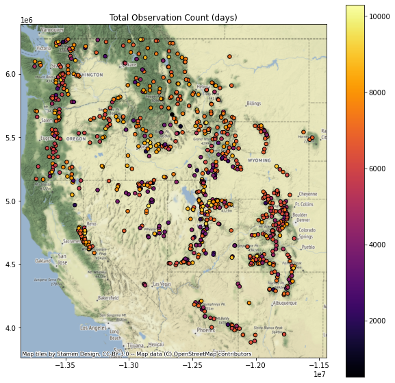
Verify your site DataFrame now has a ‘Total Observation Count (days)’ column
col = 'Total Observation Count (days)'
gdf[col] = snwd_df.count(axis=0)
col_list.append(col)
gdf.head()
| code | name | network | elevation_m | site_property | geometry | corrwithref | Total Observation Count (days) | |
|---|---|---|---|---|---|---|---|---|
| index | ||||||||
| SNOTEL:301_CA_SNTL | 301_CA_SNTL | Adin Mtn | SNOTEL | 1886.712036 | {'county': 'Modoc', 'state': 'California', 'si... | POINT (-544242.606 -64533.121) | 0.582154 | 8603.0 |
| SNOTEL:907_UT_SNTL | 907_UT_SNTL | Agua Canyon | SNOTEL | 2712.719971 | {'county': 'Kane', 'state': 'Utah', 'site_comm... | POINT (176554.295 -496466.990) | 0.454722 | 8540.0 |
| SNOTEL:916_MT_SNTL | 916_MT_SNTL | Albro Lake | SNOTEL | 2529.840088 | {'county': 'Madison', 'state': 'Montana', 'sit... | POINT (179938.808 403391.205) | 0.849032 | 9291.0 |
| SNOTEL:908_WA_SNTL | 908_WA_SNTL | Alpine Meadows | SNOTEL | 1066.800049 | {'county': 'King', 'state': 'Washington', 'sit... | POINT (-556800.380 667749.727) | 0.942259 | 6458.0 |
| SNOTEL:302_OR_SNTL | 302_OR_SNTL | Aneroid Lake #2 | SNOTEL | 2255.520020 | {'county': 'Wallowa', 'state': 'Oregon', 'site... | POINT (-228997.265 362101.867) | 0.941587 | 7586.0 |
Your Turn! Calculate at least 3 of the following metrics
Extra credit: Try all of them!
Add a column for the long-term max snow depth on record for each site
Might need to be careful about measurement errors here - maybe look at values and filter obvious outliers
Could also consider a threshold for minimum count of valid days
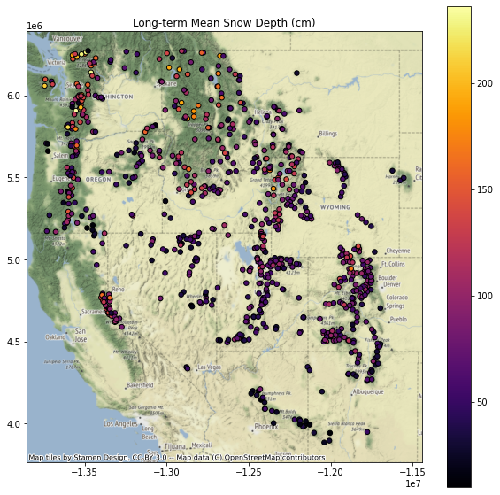
Add a column for the long-term mean snow depth at each site
Note: to do this properly, probably want to remove any values near 0 (no snow on the ground) before computing the mean
Maybe a threshold of 1 cm?
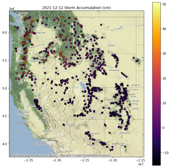
Add a column for the daily difference (snow accumulation) at all sites for a recent storm event
Note, Pandas uses a
Timestampobject that wraps the commond Pythondatetimeobjectspd.Timestamp(‘YYYY-MM-DD’)
Note, you may need to use
mydataframe.loc[pd.Timestamp('YYYY-MM-DD')]
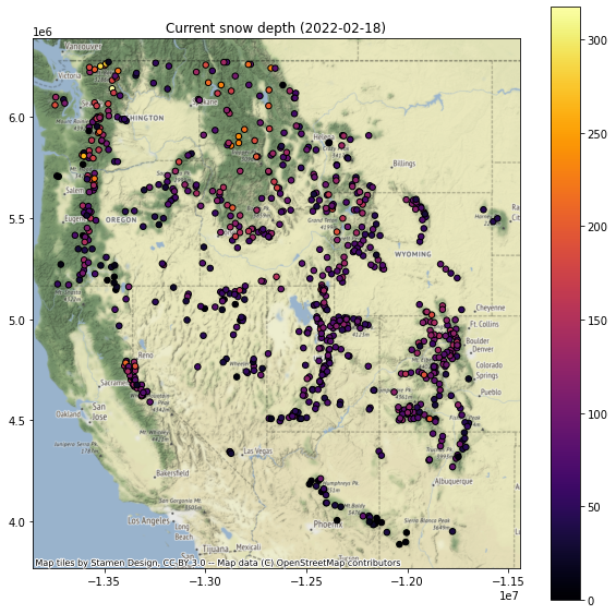
Add a column for the current snow depth for a recent day (say, yesterday) in the time series
Use a relative index value here to get the latest Timestamp (like -1, or maybe -2)
Note that using timestamp for today could have limited returns, as latest data from some stations have not been integrated into database
Note that the index is not a string, it is a Pandas Timestamp object:
pd.Timestamp('2019-02-06 00:00:00')
Add a column for the percent of “normal” snow depth for most recent day
We did this for a single site earlier
Need to compute the long-term median snow depth for this same doy at all sites
See earlier example, where we grouped by
df.index.dayofyear, then aggregated
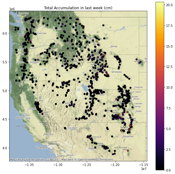
Add a column for total snow accumulation in the past week
Use a slice of pandas Timestamps to index
Can define using today’s Timestamp and then calculate the timestamp from 7 days ago using a Timedelta object
You’ll want to only include the days with positive snow accumulation (excluding days where no new snow fell or snow depth decreased)
Can then compute a sum
Create some scatterplots to review these new metrics
Hint: remove NaN records on the fly before plotting - see the
dropna()methodBest to apply after isolating the column you want to plot, consider
mydataframe[['max', 'geometry]].dropna().plot(column='max', ...)
Can plot separately, or create a figure with multiple subplots, and add titles/labels appropriately
I create a function to create the plot, and then looped over each column name I wanted to plot
for col in col_list:
    f, ax = plt.subplots(figsize=(10,10))
    ax.set_title(col)
    gdf[[col, 'geometry']].to_crs('EPSG:3857').dropna().plot(ax=ax, column=col, markersize=30, edgecolor='k', cmap='inferno', legend=True)
    ctx.add_basemap(ax=ax, source=ctx.providers.Stamen.Terrain)

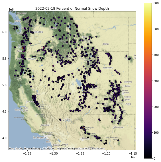
Replot percent of normal (descending sort)
Plotting order can be important when you have larger markers that overlap - you can end up with very different interpretations depending on values displayed on top of the plot
Let’s explorer this by reviewing the “percent of normal snow depth” plot with ascending and descending order
This should be pretty straightforward to sort and plot
gdf.to_crs('EPSG:3857')[[col, 'geometry']].dropna().sort_values(by=col, ascending=False).plot()Need to set the column name appropriately
Replot percent of normal (ascending sort)
Note: plotting order can be important, leading to different interpreations! For example, compare values over the Sierra Nevada in CA in the above two plots.
Can you identify the SNOTEL site with: ✍️
Greatest long-term maximum snow depth
Are we sure that this is the absolute true maximum? What happens if the snow gets higher than the instrument?
Greatest accumulation in past week
Where should I go skiing this weekend if I like deep snow?
Extra Credit: Repeat the above plotting for the WA state extent
Extra Credit: Limit your analysis to only include stations with >15 years of data
Part 8: Interpolating sparse values
Let’s create continuous gridded values (AKA Raster!) from our sparse point data
Note that we wouldn’t do this in practice, as there are much more sophisticated approaches one should use here, but let’s use this dataset to explore some basic interpolation approaches
We’ll use the
scipy.interpolate.griddatafunction here, using ‘nearest’ to start, andscipy.interpolate.Rbf
Specify the column name of variable to interpolate
col = f'Current snow depth ({ts.date()})'
#col = f'{ts_str} Storm Accumulation (cm)'
#col = f'Total Accumulation in last week (cm)'
Review the comments/code in the following cells, then run
#Extract the column and geometry, drop NaNs
gdf_dropna = gdf.to_crs(aea_proj)[[col,'geometry']].dropna()
#Pull out (x,y,val)
x = gdf_dropna.geometry.x
y = gdf_dropna.geometry.y
z = gdf_dropna[col]
#Get min and max values
zlim = (z.min(), z.max())
#Compute the spatial extent of the points - we will interpolate across this domain
bounds = gdf_dropna.total_bounds
#Spatial interpolation step of 10 km
dx,dy = (10000,10000)
#Limit to WA state
#bounds = wa_state.total_bounds
#dx,dy = (1000,1000)
#Create 1D arrays of grid cell coordinates in the x and y directions
xi = np.arange(np.floor(bounds[0]), np.ceil(bounds[2]),dx)
yi = np.arange(np.floor(bounds[1]), np.ceil(bounds[3]),dy)
#Function that will plot the interpolated grid, overlaying original values
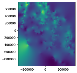
def plotinterp(zi):
f, ax = plt.subplots(figsize=(10,10))
#Define extent of the interpolated grid in projected coordinate system, using matplotlib extent format (left, right, bottom, top)
mpl_extent = [bounds[0], bounds[2], bounds[1], bounds[3]]
#Plot the interpolated grid, providing known extent
#Note: need the [::-1] to flip the grid in the y direction
ax.imshow(zi[::-1,], cmap='inferno', extent=mpl_extent, clim=zlim)
#Overlay the original point values with the same color ramp
gdf_dropna.plot(ax=ax, column=col, cmap='inferno', markersize=30, edgecolor='0.5', vmin=zlim[0], vmax=zlim[1], legend=True)
#Overlay WA polygon
#wa_state.plot(ax=ax, facecolor='none', edgecolor='white')
ax.autoscale(False)
states_gdf_proj.plot(ax=ax, facecolor='none', edgecolor='white')
#Make sure aspect is equal
ax.set_aspect('equal')
#Create 2D grids from the xi and yi grid cell coordinates
xx, yy = np.meshgrid(xi, yi)
#Interpolate values using griddata
zi = scipy.interpolate.griddata((x,y), z, (xx, yy), method='nearest')
plotinterp(zi)

Radial basis function interpolation
#Use Radial basis function interpolation
f = scipy.interpolate.Rbf(x,y,z, function='linear')
zi = f(xx, yy)
plotinterp(zi)

Explore this a bit
Try a few different interpolation methods for griddata and Rbf
Extra Credit: Play around with some other unstructured data interpolation methods
https://docs.scipy.org/doc/scipy/reference/interpolate.html#multivariate-interpolation
Others outside of scipy.interpolate
Write out the interpolated snow depth grid using rasterio (raster review)
#Grid origin (center of pixel?)
origin = (xi.min(), yi.min())
print(origin)
#Grid cell size
print(dx, dy)
(-746621.0, -986535.0)
10000 10000
#https://gis.stackexchange.com/questions/279953/numpy-array-to-gtiff-using-rasterio-without-source-raster
import rasterio as rio

transform = rio.transform.from_origin(xi.min(), yi.max(), dx, dy)

out_fn = 'snotel_interp_test.tif'
new_dataset = rio.open(out_fn, 'w', driver='GTiff',
                            height = zi.shape[0], width = zi.shape[1],
                            count=1, dtype=str(zi.dtype),
                            crs=gdf.crs,
                            transform=transform)

new_dataset.write(zi[::-1,], 1)
new_dataset.close()
!ls -l $out_fn
-rw-r--r-- 1 jovyan users 226947 Feb 25 21:14 snotel_interp_test.tif
Load from disk to verify
from rasterio.plot import show
with rio.open(out_fn) as src:
    print(src.profile)
    show(src)
{'driver': 'GTiff', 'dtype': 'float64', 'nodata': None, 'width': 158, 'height': 179, 'count': 1, 'crs': CRS.from_wkt('PROJCS["unknown",GEOGCS["WGS 84",DATUM["WGS_1984",SPHEROID["WGS 84",6378137,298.257223563,AUTHORITY["EPSG","7030"]],AUTHORITY["EPSG","6326"]],PRIMEM["Greenwich",0],UNIT["degree",0.0174532925199433,AUTHORITY["EPSG","9122"]],AUTHORITY["EPSG","4326"]],PROJECTION["Albers_Conic_Equal_Area"],PARAMETER["latitude_of_center",42],PARAMETER["longitude_of_center",-114.27],PARAMETER["standard_parallel_1",37],PARAMETER["standard_parallel_2",47],PARAMETER["false_easting",0],PARAMETER["false_northing",0],UNIT["metre",1,AUTHORITY["EPSG","9001"]],AXIS["Easting",EAST],AXIS["Northing",NORTH]]'), 'transform': Affine(10000.0, 0.0, -746621.0,
       0.0, -10000.0, 793465.0), 'tiled': False, 'interleave': 'band'}
Extra Credit: Clip interpolated grid to buffered radius around all stations
Clip the interpolated rasters within 20 km of stations
Extra Credit: Limit interpolation or clip to:
Mountain ecoregion: https://www.epa.gov/eco-research/level-iii-and-iv-ecoregions-continental-united-states
Mountain classes: https://rmgsc.cr.usgs.gov/gme/
Observed recent snowcover mask derived from MODIS data for the corresponding date
See great resource Snow Today at the National Snow and Ice Data Center: https://nsidc.org/snow-today
Extra Credit: Spatial Correlation, Semivariogram Analysis and Kriging
I ran out of time on this, but showing some simple example code from skgstat
Resources:
Some useful examples:
!mamba install -c conda-forge -q -y scikit-gstat
import skgstat as skg
#These are elevation values for the sites
coords = np.stack([sites_gdf_all_proj.geometry.x.values, sites_gdf_all_proj.geometry.y.values], axis=1)
col = 'elevation_m'
vals = sites_gdf_all_proj[col].values
#These are values from above interpolation
#coords = np.stack([x.values, y.values], axis=1)
#vals = z.values
V = skg.Variogram(coords, vals.flatten(), maxlag='median', n_lags=15, normalize=False)
fig = V.plot(show=False)

print('Sample variance: %.2f Variogram sill: %.2f' % (vals.flatten().var(), V.describe()['sill']))
Sample variance: 450311.11 Variogram sill: 239843.73
print(V.describe())
{'model': 'spherical', 'estimator': 'matheron', 'dist_func': 'euclidean', 'normalized_effective_range': 504396187723.1311, 'normalized_sill': 76153749776.40479, 'normalized_nugget': 0, 'effective_range': 710208.552274, 'sill': 239843.73263309486, 'nugget': 0, 'params': {'estimator': 'matheron', 'model': 'spherical', 'dist_func': 'euclidean', 'bin_func': 'even', 'normalize': False, 'fit_method': 'trf', 'fit_sigma': None, 'use_nugget': False, 'maxlag': 710208.5522740001, 'n_lags': 15, 'verbose': False}, 'kwargs': {}}
ok = skg.OrdinaryKriging(V, min_points=5, max_points=15, mode='exact')
#ok.transform(xx.flatten(), yy.flatten()).reshape(xx.shape)
#np.mgrid[x.min():x.max():100j, y.min():y.max():100j].shape
# build the target grid
#x = coords[:, 0]
#y = coords[:, 1]
xx, yy = np.mgrid[x.min():x.max():100j, y.min():y.max():100j]
field = ok.transform(xx.flatten(), yy.flatten()).reshape(xx.shape)
s2 = ok.sigma.reshape(xx.shape)
fig, axes = plt.subplots(1, 2, figsize=(16, 8))

# rescale the coordinates to fit the interpolation raster
x_ = (x - x.min()) / (x.max() - x.min()) * 100
y_ = (y - y.min()) / (y.max() - y.min()) * 100

art = axes[0].matshow(field.T, origin='lower', cmap='plasma', vmin=vals.min(), vmax=vals.max())
axes[0].set_title('Interpolation')
axes[0].plot(x_, y_, '+w')
axes[0].set_xlim((0, 100))
axes[0].set_ylim((0, 100))
plt.colorbar(art, ax=axes[0])
art = axes[1].matshow(s2.T, origin='lower', cmap='YlGn_r')
axes[1].set_title('Kriging Error')
plt.colorbar(art, ax=axes[1])
axes[1].plot(x_, y_, '+w')
axes[1].set_xlim((0, 100))
axes[1].set_ylim((0, 100))
(0.0, 100.0)

Extra Credit: Snow depth vs. elevation analysis for WA
Let’s look at snow depth across WA on the most recent day in the record
Create a quick scatterplot of elevation vs. snow depth for all sites on this day
Do you see a relationship?
Try elevation vs. long-term mean
Extra Credit: Linear regression of snow depth vs. elevation
Several convenient options in Python. Here are a few:
How good is your fit?
Compare accumulation vs elevation for a recent storm event with abundant lowland snow (e.g., Feb 11) with another more typical accumulation event (where low elevations receive rain and mountains receive snow)
Extra Credit: Consider other variables that could affect snow depth
Distance from the coast (remember the Lab06 exercise calculating distance from WA perimiter?)
Mean winter daily temperature (from PRISM)
Extra credit (or, some additional items to explore)
If you have some time (or curiosity), feel free to explore some of these, or define your own questions. This is a really rich dataset, and those of you interested in snow or hydrology may have some cool ideas.
Compute snow depth statistics across all sites grouping by Water Year (or by month/day range where snow is typically present)
Identify date of first major snow accumulation event each year, date of max snow depth, date of snow disappearance - any evolution over time?
Split sites into elevation bands and analyze various metrics
Perform watershed-scale analysis
Explore other interpolation methods for sparse data
Create an animated map of daily accumulation in WA for the past two weeks
Look at other variables for the SNOTEL sites (e.g., snow water equivalent, temperature data)
Note that WTEQ_D time series begin much earlier than SNWD_D
Create maps of snow density for WA using WTEQ_D and SNWD_D